
Editing Basics in Easil
Amazing graphics are why you're here, and our professionally pre-designed templates will help you create them easily! Learn how here.
Once you have loaded a design in Easil, all of the basic design tools for editing your template are located in the top ActionBar.
Start editing your template by simply selecting (clicking) on the element you would like to change. A single click on any element will provide you with all the editing options that are available for that item.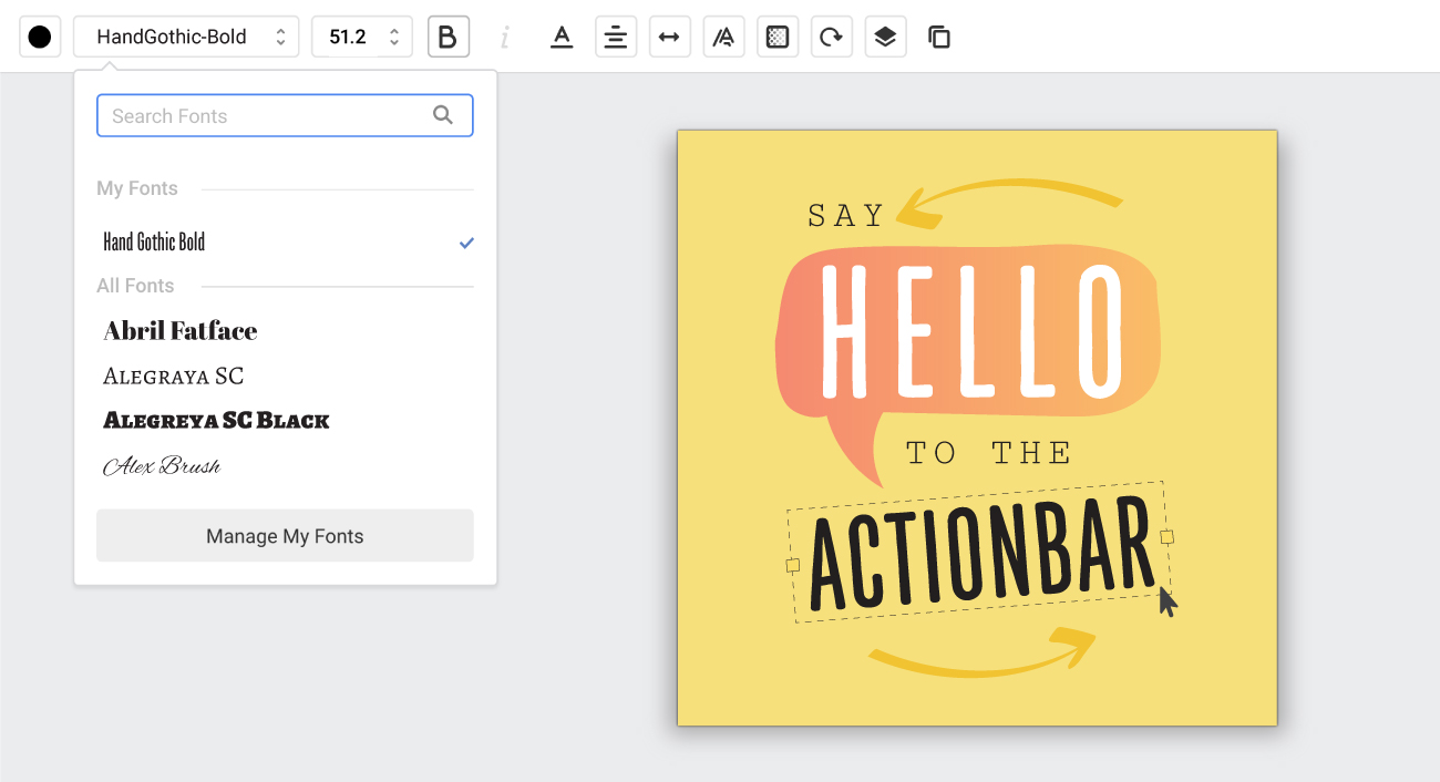
You can change the Opacity, Angle, Position & Scale of all Easil elements, as well as duplicate or delete any element, via the inputs and buttons in the ActionBar. Different types of elements (Text, graphics etc) will have additional contextual actions available.
The tools located in the right side bar are for adding items to your design, and managing your files.
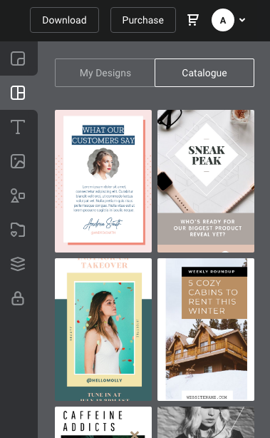
You can open and close the Side bar by clicking on the small notch near the base of the side bar, to give you more room on your design canvas when you're not requiring any of the tools. When you do need to add to your design, simply click on the icon for the relevant tool and the panel will re-open with the relevant tool ready to go.
Each tool is explained below:
Page Tab:
The Page tab navigates you through your document. If you have multiple design sizes in your campaign, you can navigate to each size by clicking on the title tiles. Each design can be downloaded for proofing, deleted, duplicated, ordered or resized from this area.
Layouts Tab:
The layouts tab allows you to access other templates available to add as an additional page to your current working file.
Choose from either another Easil template, or one of your own Easil designs from your Workspace, and add the page or replace the current content. Once you have your new page added, you can move single or groups of items across pages to merge designs. This feature is currently available to Plus and Edge users.
Text Tab:
The Text tab is used for adding text boxes or text graphics to your canvas. There are two types of text graphics: elements such as banners, which contain editable text within them and ornate, non-editable text.
If you have set-up Brand Fonts via your Easil Brand Kit, you'll also be able to access the fonts in this section to quickly add to your design
Images Tab:
The Images tab displays all types of images in Easil – photographic, and graphical. It is also used for uploading and managing your own photos, including storing them in handy folders.
Graphics Tab:
The Graphics tab contains ‘Vector’ shapes and graphics. These are usually more ‘flat’ in appearance. You can view these by using either popular categories or via the Search bar. Graphics have unique properties that allow you to perform many editing functions such as changing the color/s, rotating, stretching and extending – in the case of lines, changing the opacity and more.
By adding a graphic to your design, or selecting one already on your canvas, you will be presented with all of the available options in the Actionbar.
Favorites & Assets Tab:
The Favorites Tab holds copies of your favorited images, graphics and text within one space. This allows you to re-use elements for other pages in your current design, as well as others. It’s a great place to store your branding elements such as shapes or patterns that you use frequently.
The Assets tab holds copies of all graphics and photos used in your current design, allowing easy re-use on other page or sizes as required.
Layers Tab:
The Layers tab is your hub for organising all the elements in your design.
Layers are organised from top to bottom, as they appear in your design canvas. Using layers you can create groups, allowing you to easily select that group of objects and scale (increase or decrease the size), Drag single layers or groups of items to another page in your document, or even hide a layer or group instead of deleting it, if you’re not sure that you won’t need it.
The layers tab is also used to organise pages. You can duplicate pages here, and also re-arrange by dragging them down in order.
Lock Tab:
The lock tab is for locking down various permissions on any element in your design, and also for setting overall document permissions.
By clicking on an element, and then the lock tab, you can set anything from preventing an element from being deleted, to removing the ability to change the font, color, size, filter, and so on.
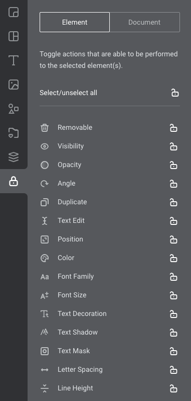
This is important when working with teams to control the integrity of your brand, but can also come in handy to prevent accidental moving of elements when working with complex files, or several pages.