

Color is an important part of a professional design. A consistent palette helps your campaign artwork feel cohesive and easier to recognise.
Easil’s color options change to suit what you have selected. You can apply colors to page backgrounds, text, captions, table cells, QR codes, and color-editable graphics.
Open the color options
- Select the page, text box, table cell, or graphic you want to change.
- Select its color control in the Actionbar.
- Choose Solid, Linear, or Radial when those fill types are available.
Some items have more than one color control. For example, a multi-color graphic displays Element Colors, while captions have separate Text, Text Highlight, Background, and BG Highlight colors.
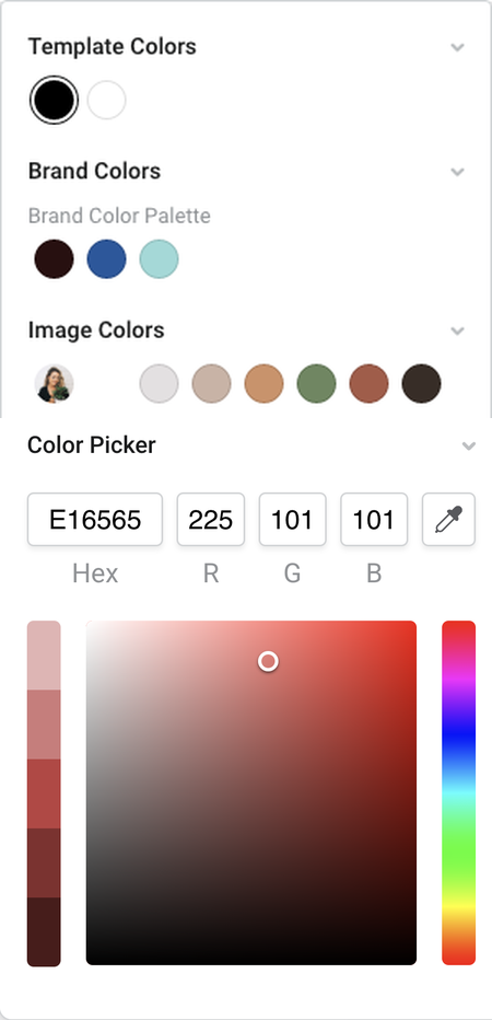
Choose a solid color
With Solid selected, the popout can include these sections:
- Background Color shows the current page or table-cell background and, where available, the transparent option.
- Element Colors shows the editable fills in a multi-color graphic. Select the fill you want to update first.
- Template Colors contains colors already used in the current design.
- Brand Colors contains approved colors from your team’s Brand Kit, grouped by palette.
- Image Colors contains palettes generated from images used in the design.
- Color Picker lets you choose a custom color.
The sections you see depend on the selected item and any Brand Kit restrictions applied to the design.
Template Colors
Use Template Colors to reuse solid colors and gradient palettes already in the design. This section updates as colors are added to or removed from the design.
Open Template Colors, then select a swatch to apply it to the current fill.
Brand Colors
If your team has a Brand Kit, open Brand Colors and select an approved swatch. If a Brand Color has been named, hover over the swatch to see its name and Hex value.
A matching Brand Color name can also appear when the same color is shown in Template Colors, Image Colors, Background Color, or Element Colors.
Image Colors
Open Image Colors to see a palette for each image used in the design. Select a swatch to match text, graphics, or backgrounds to tones from that image.
The available Image Colors change when images are added to or removed from the design.
Color Picker
Open Color Picker to choose a custom color from the spectrum or enter a specific Hex or RGB value. If your browser supports it, use the Eye Dropper to sample a color from the screen.
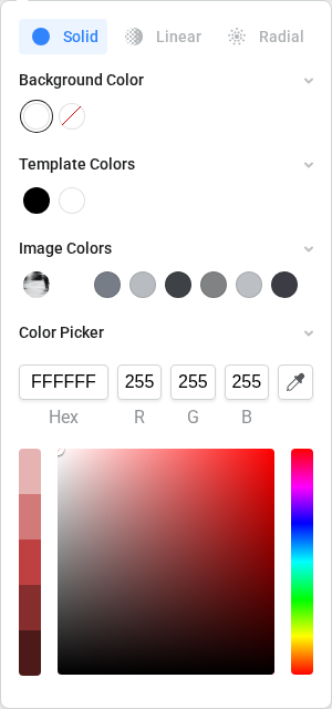
Once the color is used in the design, it also becomes available in Template Colors.
Create a gradient
Compatible fills display three options at the top of the color popout: Solid, Linear, and Radial.
Linear gradients
Select Linear to create a gradient along a line.
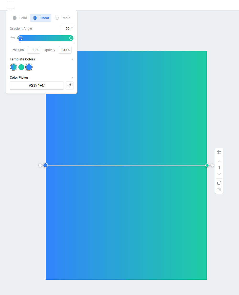
You can:
- Select a color stop below the gradient bar.
- Choose the stop color from Template Colors, Brand Colors, or the Color Picker.
- Enter the stop’s Position and Opacity, or drag it along the gradient bar.
- Select the gradient bar to add another stop.
- Enter a Gradient Angle, use Reverse gradient, or drag the on-canvas handles to change the direction.
A gradient always keeps at least two stops. On desktop, remove an extra stop by dragging it away from the gradient bar.
Radial gradients
Select Radial to create a gradient that radiates from a centre point.
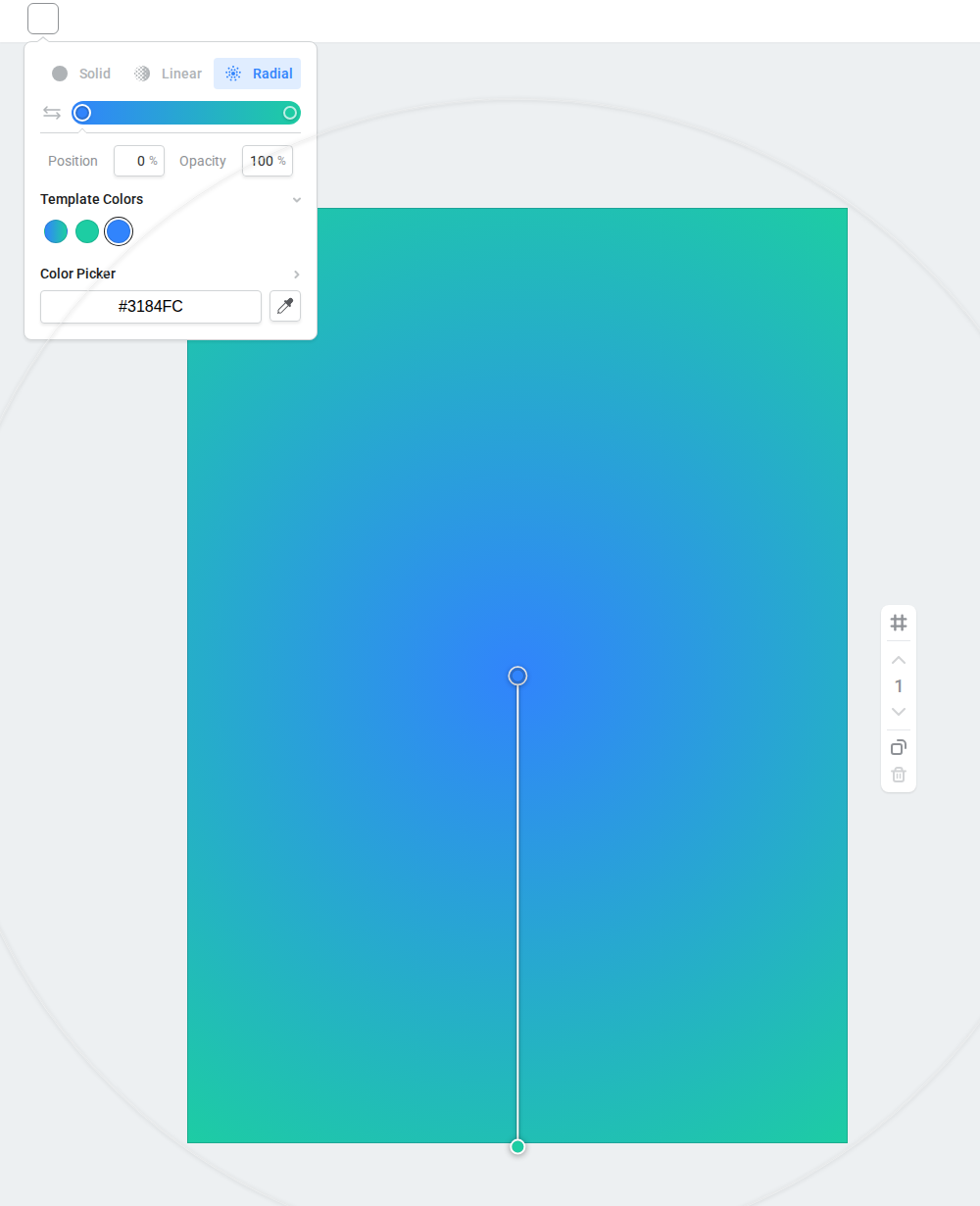
Radial gradients use the same color-stop, position, opacity, and reverse controls as linear gradients. On the canvas, drag the centre handle to reposition the gradient, then drag the colored handles to adjust the stop positions.
Changes preview immediately and are saved when you finish editing the color.
When editing a gradient stop on desktop, use Template Colors, Brand Colors, or the Color Picker. Image Colors are available for solid fills, but are not displayed in the desktop gradient-stop controls. Use the stop’s Opacity setting when you need transparency in a gradient.
Where gradients are available
Linear and radial fills are available for:
- page backgrounds;
- compatible table-cell backgrounds;
- a whole text box when you are not editing its text;
- compatible color-editable graphics and curved text;
- QR code foreground colors.
For a mixed selection, gradient options appear only when every selected item supports them.
Controls that use solid colors only include text while you are editing inside a text box, table text, lines, charts, grids, borders, shadows, outlines, and caption colors. If Linear and Radial are not shown, use the available solid color options for that control.
Caption colors
When a caption is selected, open Colors and choose the part you want to update: Text, Text Highlight, Background, or BG Highlight.
Caption controls use solid colors. You can still choose those colors from Template Colors, Brand Colors, Image Colors, or the Color Picker.
For the complete caption workflow, see Style captions in Easil.
Update all matching colors
First apply or preview the replacement color on the selected item. If Easil finds matching uses elsewhere in the design, Update all appears with the original and replacement color swatches. Select Update all to immediately apply the current replacement color to those matches.
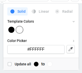
Leave Update all unselected when you want to change only the currently selected item or fill. The option does not alter colors inside photographic images.
Tips for choosing a color source
- Use Template Colors to repeat colors and gradient palettes already used in the design.
- Use Brand Colors for approved team colors.
- Use Image Colors to coordinate the design with a photograph or uploaded image.
- Use Color Picker when you need a custom Hex or RGB value.
- After choosing a replacement, use Update all only when you want that same color applied to matching uses throughout the design.
You can also learn more about changing a template background color and changing a graphic element color.