

Charts help you turn numbers into a visual element in your design. In Easil, you can add Column, Bar, Line, Pie, Donut, and Area charts, then update the data, colours, and display settings from the editor.
Adding a chart to a design
- Open your design in the Easil editor.
- Select Elements from the left sidebar.
- Select Charts.
- Choose the chart style you want to add.
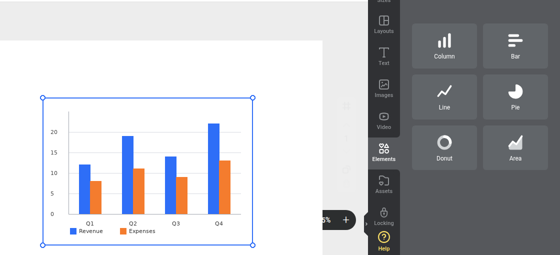
The chart is added to your design with sample data. You can move, copy, resize, rotate, layer, and adjust its opacity like other design elements.
Changing the chart type and display options
Select the chart, then select Chart Type from the action bar.
From here, you can switch between Column, Bar, Line, Pie, Donut, and Area charts. You can also show or hide chart details such as the legend, gridlines, and data labels.
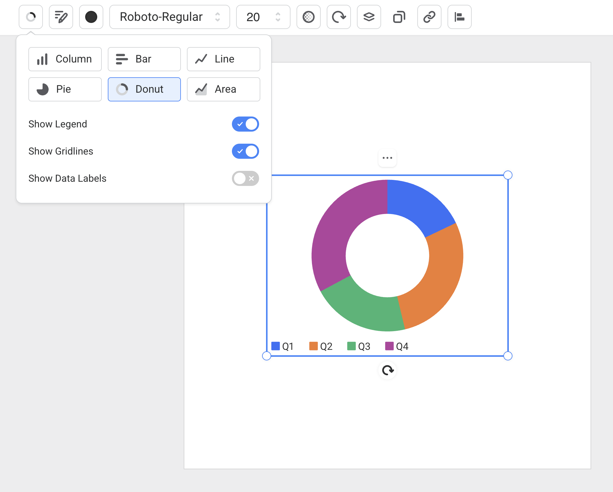
Your chart data stays with the chart when you change type, so you can try different chart styles before deciding which one works best for your design.
Editing chart data and colours
- Select the chart on the canvas.
- Select Edit Chart from the action bar.
- Update the column labels, row labels, and numeric values in the data grid.
- Use the colour swatches to update the chart colours.
- Select Done when finished.
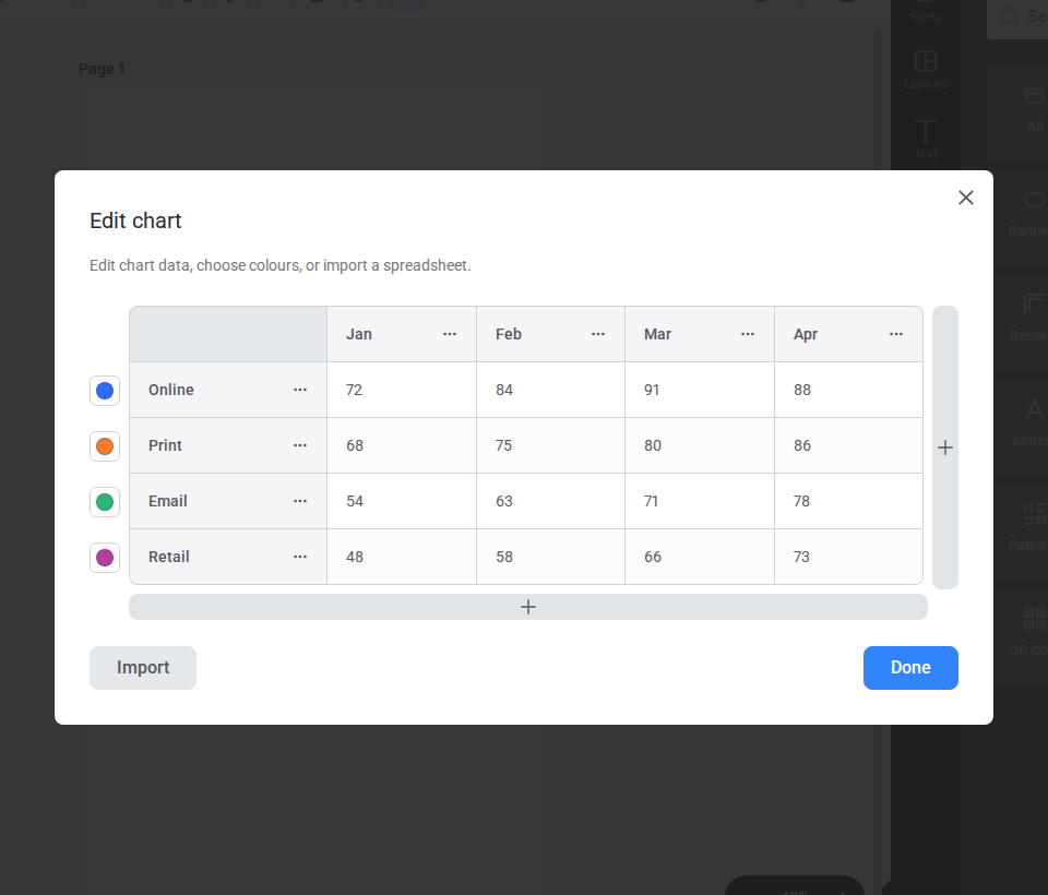
For Column, Bar, Line, and Area charts, colours apply to each data series. For Pie and Donut charts, colours apply to each slice. Pie and Donut charts only display the first data row.
Adding or removing chart data
In Edit Chart, use the row and column menus to add, duplicate, or remove chart data. This is useful when you need more series, fewer categories, or a cleaner chart layout.
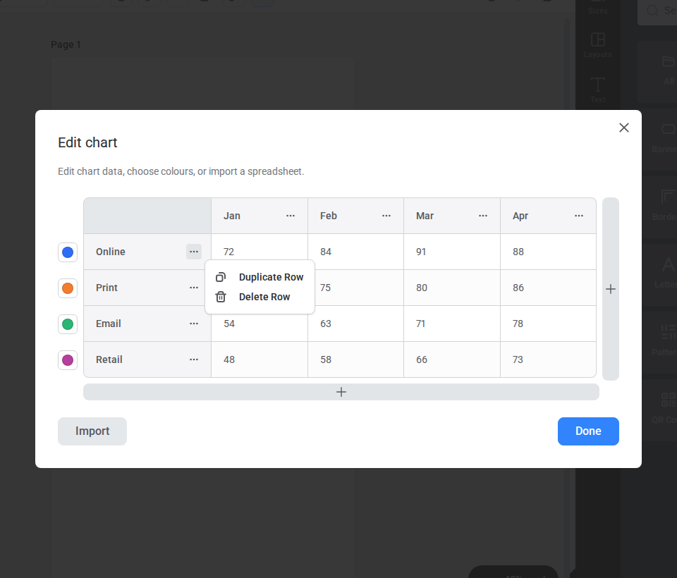
Chart values need to be numbers. If you clear a value cell, Easil treats it as 0.
Importing chart data
You can import chart data instead of entering each value manually.
- Select the chart on the canvas.
- Select Edit Chart from the action bar.
- Select Import.
- Paste a range copied from Excel or Google Sheets, then select Review. You can also upload or drag in a
.csv,.tsv, or.xlsxfile. - Check the preview and choose whether to use the first row as column labels and the first column as row labels.
- Select Import Data to replace the chart data.
- Select Done when finished.
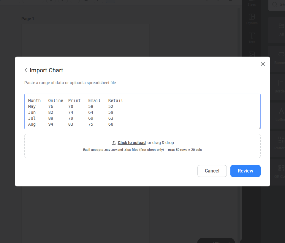
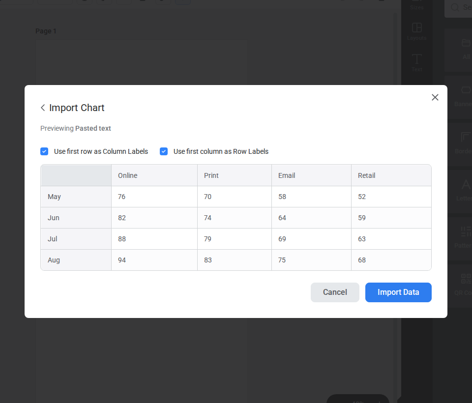
Easil supports chart imports up to 50 rows by 20 columns. If any imported cells are not numbers, Easil highlights them in the preview so you can fix the data before importing.
Formatting a chart
When a chart is selected, the action bar includes chart formatting options such as font, font size, text colour, opacity, rotation, and chart display settings.
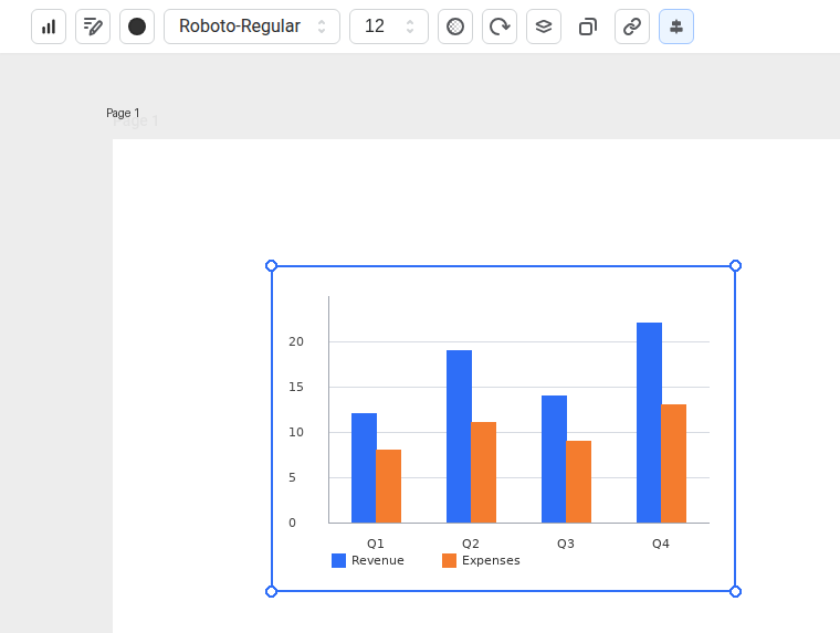
Use these settings to make the chart readable at its final design size, especially for small social posts, menus, flyers, or print designs.
Tips for working with charts
- Keep chart labels short so they stay readable.
- Use colours that match your brand or the rest of your design.
- Use Pie and Donut charts for simple part-of-whole data.
- Use Column, Bar, Line, or Area charts when you need to compare multiple values or series.
- Check the chart at its final export size before downloading or printing.